Mobile-First Design in 2026: How to Build a Better Mobile Website
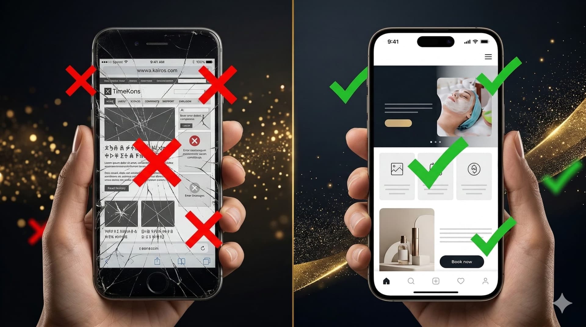
A website can look excellent on a large monitor while being frustrating to use on a smartphone.
Text becomes too small, navigation takes over half of the screen, tables extend beyond the viewport, forms require constant zooming and buttons are positioned so close together that visitors accidentally tap the wrong one.
Technically, such a website may still be responsive. The layout changes as the viewport becomes narrower. But that does not necessarily mean the mobile experience has been designed well.
This is where the Mobile-First approach becomes useful: the team considers the limitations and needs of smartphone users early in the process rather than treating mobile as a final adaptation of the desktop design.
This does not mean desktop no longer matters. Nor does it mean every project must literally begin with the smallest possible screen.
The principle is simpler: mobile users should not receive a secondary or inconvenient version of the main website.
What is Mobile-First design?
Mobile-First is an approach in which the mobile experience is considered during the early stages of information architecture, UX and design rather than after the desktop interface has already been completed.
Limited screen space forces a team to define priorities early:
- which information users need first;
- which action is most important;
- what can be simplified;
- what should not consume most of the screen;
- how navigation will work;
- how forms will be completed using touch;
- how tables, cards and interactive elements will behave.
On a large screen, poor information architecture can sometimes be disguised with additional space.
On a smartphone, that is much harder.
Responsive design and Mobile-First are not opposites
A common misconception is that responsive design and Mobile-First are competing technologies.
They describe different things.
Responsive design describes how an interface adapts to different viewport sizes.
Mobile-First is primarily an approach to design priorities and user journeys.
A website can therefore be both responsive and designed using Mobile-First principles.
The problem is not responsive development itself. The problem begins when the mobile experience is discussed only after the entire desktop website has already been approved.
Why does the mobile version matter for SEO?
Google uses the mobile version of website content for indexing and ranking through mobile-first indexing.
For this reason, important content, headings, links, metadata and other essential elements should be properly available on mobile as well as desktop.
This does not mean that making a website visually attractive on a smartphone automatically produces high search rankings.
Mobile-first indexing is primarily about which version of the content Google uses to understand a page.
SEO still depends on content quality, search intent, website structure, internal linking, technical implementation and many other factors.
1. Mobile design should begin with content priorities
A desktop screen can display a large headline, navigation, imagery, several buttons, supporting copy and decorative elements at the same time.
A smartphone shows only a small portion of the page.
The first question should therefore be:
What does the visitor need to understand first?
The first screen will often need to communicate:
- what the company offers;
- who the offer is for;
- what the visitor can do next.
If a large decorative scene, complex animation and several abstract slogans appear before the actual offer, much of the available mobile space is being used without helping the visitor complete their task.
2. Mobile navigation should be simple to understand
A navigation system with dozens of options may work on a wide desktop interface, but it needs a different presentation on a smartphone.
Visitors should be able to find important sections quickly and understand how to return to the previous level.
Complex websites may need to consider:
- menu hierarchy;
- nested categories;
- search;
- a clear close control;
- what happens after a navigation item is selected;
- access to the primary CTA;
- breadcrumb navigation where appropriate.
Creative navigation is useful only when visitors can still understand how to operate it.
3. Controls should be designed for fingers rather than cursors
Desktop users interact with a relatively precise pointer.
Smartphone users generally interact with their fingers.
This changes the requirements for interactive controls.
Tiny icons, links with little surrounding space and several controls positioned very close together increase the likelihood of accidental activation.
Mobile interfaces therefore need to consider both the visible size of a control and the space around it.
This is particularly important for:
- form controls;
- toggles;
- close buttons;
- filters;
- pagination;
- navigation items;
- cart and checkout actions.
4. Text should be readable without zooming
Visitors should not need to pinch and zoom simply to read the primary content.
Mobile readability depends on more than font size.
It is also influenced by:
- line length;
- line spacing;
- contrast;
- spacing between paragraphs;
- heading hierarchy;
- font weight;
- the amount of text grouped into a single block.
A long article can be comfortable to read on a smartphone when its structure makes the content easy to scan and follow.
By contrast, even a short piece of copy can become difficult when presented as an uninterrupted wall of text.
5. Mobile forms should be simplified
A form that is easy to complete on a laptop can become a major source of friction on a smartphone.
This is especially true when it contains ten fields, tiny checkboxes and unclear error messages.
Before adding a field, ask:
Does the business really need this information at this stage?
If a phone number, job title or company name can be collected later, there may be no need to require every detail during the initial enquiry.
A good mobile form should:
- have clear labels;
- trigger an appropriate keyboard where possible;
- explain errors clearly;
- retain entered information after an error;
- provide comfortable field and control sizes;
- avoid being obscured by the keyboard or interface elements.
6. Tables need a dedicated mobile strategy
A table containing ten columns simply cannot fit comfortably on a narrow screen.
Shrinking the entire table to smartphone width usually makes the information unreadable.
Depending on the data, the interface might:
- allow controlled horizontal scrolling;
- convert rows into cards;
- show only the most important attributes first;
- allow users to reveal additional information;
- use a different comparison format.
Mobile-First does not mean every table must become a collection of cards.
The correct solution is the one that preserves the meaning of the data while remaining usable.
7. Images should match the actual display context
There is little value in making a smartphone download an enormous image when it will be displayed at a much smaller size.
Media should be prepared with consideration for:
- actual display dimensions;
- file format;
- compression;
- screen density;
- loading priority;
- lazy loading for appropriate below-the-fold content.
Composition also needs to be reviewed.
A wide image that looks perfect on desktop may lose its primary subject when automatically cropped for a narrow mobile viewport.
8. Mobile-First and website performance are closely connected
A mobile visitor will not always have a fast connection or a high-end device.
This means some performance costs become particularly noticeable on smartphones:
- large JavaScript bundles;
- oversized images;
- video backgrounds;
- third-party widgets;
- complex 3D scenes;
- excessive analytics scripts;
- unnecessarily large font files.
This does not mean mobile websites need to be visually primitive.
But expensive visual effects should provide a clear benefit.
If a decorative experience significantly delays access to the primary content, a lighter implementation for less powerful devices may provide a better experience.
9. Animation needs separate testing on mobile
A hover interaction designed for a mouse pointer does not have a direct equivalent on a touchscreen.
Scroll-based animation can also behave differently because of a smaller viewport and different scrolling behaviour.
Desktop animation should therefore not be transferred automatically to mobile without review.
For each major effect, consider:
- whether the interaction is understandable without hover;
- whether content becomes obscured;
- whether scrolling remains responsive;
- how the effect performs on a less powerful device;
- whether the core functionality remains available without animation.
10. Important content should not disappear just because the screen is smaller
One characteristic of older mobile websites was aggressive content reduction.
The desktop version might include full service information, specifications and FAQs while the mobile page displayed only a short summary.
A smaller screen does not necessarily mean visitors need less information.
They often need the same information organized more effectively.
Useful techniques may include:
- clear headings;
- shorter paragraphs;
- accordions where appropriate;
- logical content grouping;
- anchor links;
- internal page navigation.
Important information should not simply disappear.
11. Mobile-First does not mean one fixed layout for every phone
There are hundreds of combinations of viewport width, height, pixel density and browser interface.
Professional responsive design therefore does not mean creating a separate layout for every iPhone or Samsung model.
The goal is to create a flexible system that behaves well across ranges of screen sizes.
This is why testing should go beyond a few popular frames in a design tool.
Intermediate widths, orientation changes and real content overflow also need to be considered.
12. Mobile UX should be tested on real devices
Browser device emulation is extremely useful during development.
But it does not completely replace a physical smartphone.
Testing on a real device can reveal issues that are easy to miss on a desktop computer:
- awkward button placement;
- keyboard behaviour;
- the real scrolling experience;
- animation delays;
- browser interface overlays;
- accidental taps;
- difficulty using the interface with one hand.
Even a short manual test of the primary user journeys can identify problems that are invisible in a static design file.
13. Do not design around a universal mobile traffic percentage
There are many studies online reporting different percentages of smartphone usage.
For an individual business, its own analytics are much more useful.
A consumer-facing project may receive the majority of its traffic from mobile devices.
A complex B2B platform may still see a significant share of high-value actions completed on desktop.
Before redesigning, review:
- mobile versus desktop traffic;
- conversion rates by device category;
- common mobile viewport sizes;
- pages with unusually high exits;
- form errors;
- performance across device types.
This allows design decisions to reflect the behaviour of your actual audience rather than a generic statistic found online.
Common mobile website mistakes
A mobile website review should pay particular attention to issues such as:
- text that is too small;
- interactive controls positioned too close together;
- page-wide horizontal scrolling;
- content overflowing the viewport;
- oversized hero sections;
- intrusive pop-ups;
- forms with unnecessary fields;
- oversized images and videos;
- animation that makes scrolling feel slow;
- features that depend entirely on hover;
- important content hidden on mobile;
- confusing navigation;
- primary CTAs that are difficult to find.
When should a mobile experience be redesigned?
Not every website needs a complete redesign.
Sometimes improving typography, navigation, forms and a few problematic components is enough.
A more substantial rebuild may be justified when:
- the entire information architecture was designed exclusively around desktop;
- mobile layouts depend on a growing collection of one-off fixes;
- important functionality is uncomfortable to use on smartphones;
- the site has systematic performance problems;
- important content is missing from the mobile experience;
- the business has evolved while the website architecture has remained unchanged.
A technical and UX review can help distinguish local issues from structural problems before committing to a full rebuild.
The TimeKairos approach
At TimeKairos, we do not treat mobile as the final stage where a finished desktop interface is simply forced into a narrower viewport.
Key mobile journeys are considered while working on structure, design and components.
We review how content priorities change, how navigation and forms behave, what happens to animation and whether visual decisions create unnecessary performance costs on less powerful devices.
At the same time, Mobile-First does not mean reducing every website to a minimal interface.
The goal is to preserve the character of the brand and the required functionality without forcing users to fight the interface simply because they opened the website on a smartphone.
Conclusion
Mobile-First is not a trend or a requirement to make mobile more important than every other platform.
It is an approach to designing around the real constraints of smaller screens, touch input, mobile performance and the context in which smartphones are used.
A strong mobile experience should not feel like a reduced desktop website.
Visitors should receive the same essential information and functionality through an interface appropriate for their device.
If someone opens your website on a smartphone, they should not feel that they chose the “wrong” device.