Back to Journal

Why Your Website Isn't Converting: 7 Common Reasons and How to Find Them

Why Your Website Isn't Converting: 7 Common Reasons and How to Find Them
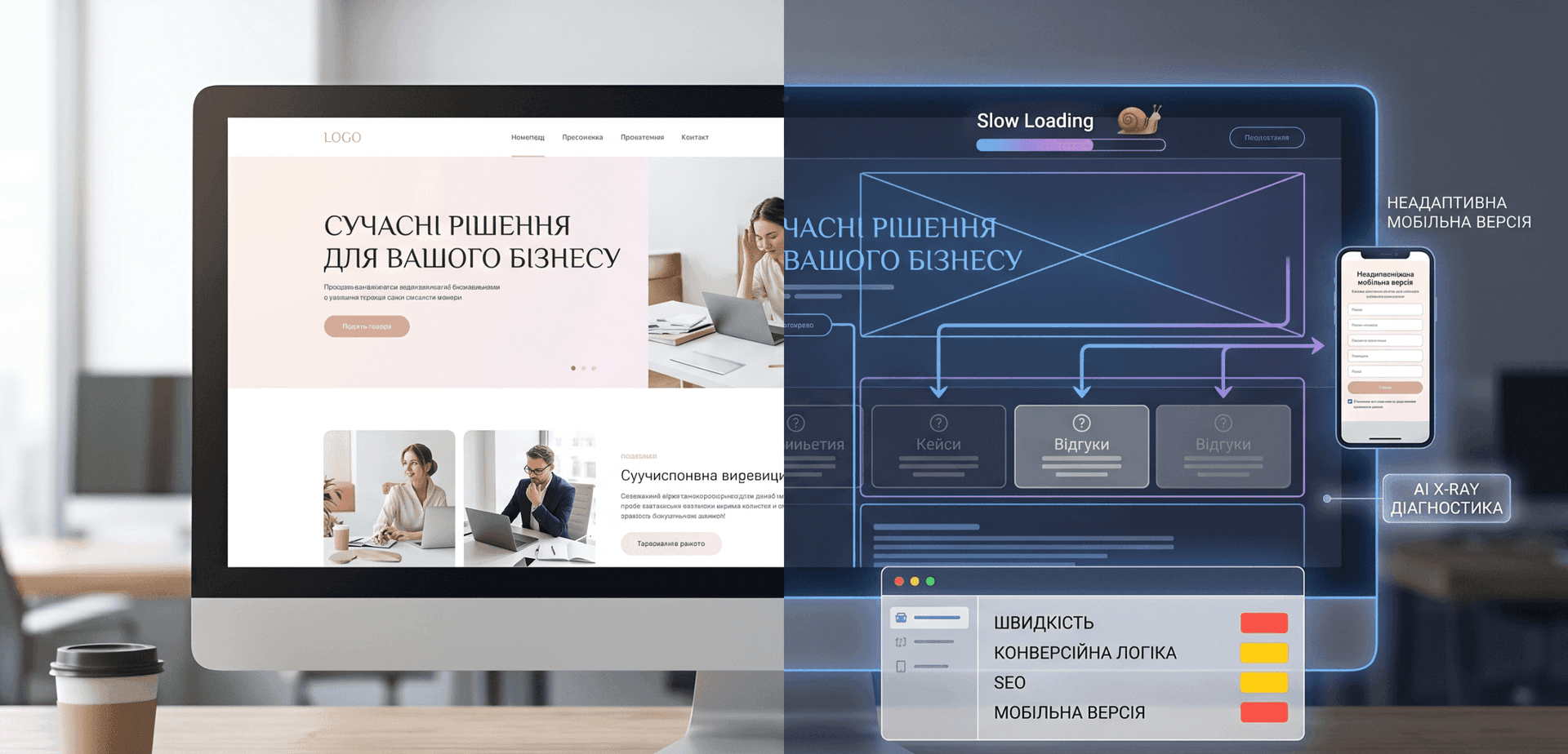
Your advertising is running. People are reaching the website. Analytics shows traffic — but enquiries, calls or purchases remain below expectations. It is tempting to immediately change the ads, rewrite the headline or redesign the entire website. Low conversion, however, can originate at several different stages. A visitor may not understand the offer. They may not trust the company. They may struggle to find the next action, abandon a form on mobile, experience a slow interface or successfully contact the business without the conversion ever being recorded in analytics. The question “Why isn't the website converting?” should therefore begin with diagnosis rather than an automatic redesign.

First define what “not converting” actually means

Several very different situations can produce the same complaint:
  • almost no traffic reaches the website;
  • traffic arrives but leaves quickly;
  • visitors read the page but do not activate the CTA;
  • people begin a form but do not complete it;
  • enquiries arrive but are poorly qualified;
  • real leads exist but analytics does not record them.
These are different problems. SEO cannot fix a broken checkout, while a redesign cannot correct advertising that attracts the wrong audience. A useful diagnostic journey is: traffic source → landing page → offer → trust → action → form or checkout → confirmation → analytics.

1. Visitors do not understand the offer

An attractive hero section can still be unclear. Generic messages such as “innovative solutions for modern businesses” may sound polished without explaining what the company actually sells. A visitor should be able to understand:
  • what the product or service is;
  • who it is designed for;
  • which problem it solves;
  • what differentiates the approach;
  • what the next action is.
The entire commercial proposition does not need to fit into one headline. The central value, however, should not require investigation.

2. The website does not provide enough trust

Submitting an enquiry or making a payment involves risk. The visitor may still know very little about the business. Depending on the industry, useful trust elements can include:
  • real case studies;
  • work examples;
  • verifiable reviews;
  • team information;
  • a clear process;
  • contact information;
  • legal and business details;
  • payment or refund terms;
  • FAQs;
  • honest service limitations.
A few specific pieces of evidence are often more useful than a large collection of unsupported numbers.

3. The page does not provide a clear next step

A visitor may understand the company perfectly and still reach the bottom of the page wondering what to do next. Calls to action should describe the next step where possible. For example:
  • “Get a project estimate”;
  • “Audit my website”;
  • “View the demo”;
  • “Discuss migration”;
  • “Compare the options”.
These often communicate more than a generic “Submit”. At the same time, repeating the same CTA after every paragraph can create unnecessary visual noise.

4. The mobile layout is responsive but the mobile experience is poor

A responsive layout is not automatically a good mobile experience. Common mobile friction includes:
  • very long hero sections;
  • small typography;
  • hard-to-tap controls;
  • oversized sticky elements;
  • awkward forms;
  • animations that interfere with scrolling;
  • important information buried too far down the page.
The most useful test is simple: complete the entire conversion journey on a real smartphone. Start from the same ad or search result a customer would use and continue until the final confirmation.

5. Performance creates friction at a critical moment

Performance is one of the genuinely technical factors that can interfere with conversion. Examples include:
  • primary content appearing slowly;
  • buttons responding with a delay;
  • layout shifting during loading;
  • forms freezing;
  • checkout transitions taking too long.
Core Web Vitals can help evaluate loading performance, responsiveness and visual stability. Useful metrics include LCP, INP and CLS. Performance should not be reduced to a universal sales formula, however. Improving a metric does not guarantee a fixed percentage increase in conversion for every business.

6. Forms or checkout create unnecessary friction

Some websites lose the user when the conversion is almost complete. Common causes include:
  • too many mandatory fields;
  • unclear input requirements;
  • error messages that do not explain the problem;
  • forms that erase entered information after an error;
  • forced registration without an obvious reason;
  • too many checkout steps;
  • no clear explanation of what happens after submission;
  • buttons that fail in particular browsers.
Not every form should be reduced to a name and telephone number. A complex B2B service may genuinely need qualification information. The relevant question is whether every mandatory field is necessary before the first conversation.

Test the complete lead-delivery chain

Do not stop when the interface displays “Successfully submitted”. Test: form → backend → CRM / email / notification system → sales team. A form can appear successful while the business never receives the enquiry.

7. Analytics is reporting the wrong story

Sometimes the conversion problem exists primarily in measurement. For example:
  • GA4 does not record form submission;
  • one lead is recorded twice;
  • the advertising pixel misses the conversion event;
  • phone calls are not tracked;
  • messenger enquiries are absent from reports;
  • payment takes place on another domain and attribution is lost;
  • internal team traffic distorts results.
Before making an expensive redesign decision, verify that the data used to justify the decision is accurate.

Where do SEO and AI search fit?

SEO and AI visibility are important, but they primarily affect discovery. They answer: “Can a potential customer find the website?” Conversion answers: “What happens after the visitor arrives?” Missing Schema.org does not, by itself, explain why someone who arrived from a paid advertisement read the page and abandoned a contact form. These areas should be connected without treating them as the same problem. If discoverability is the issue, TimeKairos has a separate technical SEO and AI readiness direction.

What about code quality?

Imperfect code does not automatically mean poor conversion. Implementation becomes a business problem when it causes observable consequences such as:
  • slow pages;
  • broken interactions;
  • unreliable forms;
  • mobile issues;
  • difficulty testing new hypotheses;
  • disproportionately expensive changes.
The impact matters more than the label attached to the technology.

Not every conversion problem requires a new website

Sometimes the result can be improved by addressing a relatively small number of issues:
  • clarifying the offer;
  • adding credible evidence;
  • simplifying a form;
  • fixing mobile UX;
  • improving one important page's performance;
  • repairing analytics;
  • changing the CTA structure.
A useful first step can therefore be a technical website audit rather than automatically commissioning a complete rebuild.

A practical conversion diagnosis process

  1. Review traffic quality. Are the right users reaching the page?
  2. Review the landing page. Does it match the advertisement or search intent?
  3. Complete the mobile journey.
  4. Check performance and stability.
  5. Review trust evidence.
  6. Complete the form or checkout yourself.
  7. Compare analytics with actual leads.

What should be measured after changes?

Depending on the business model, useful metrics may include:
  • conversion rate;
  • qualified enquiries;
  • cost per lead;
  • primary CTA clicks;
  • form starts;
  • form completions;
  • checkout completion;
  • calls;
  • technical errors;
  • mobile and desktop results separately.
Where traffic volume is sufficient, significant changes can be tested rather than judged entirely by personal preference.

When most traffic comes from paid advertising

Message continuity between the advertisement and the landing page becomes especially important. A person who clicked an advertisement for one specific service should not need to search through ten unrelated services after arriving. In some campaigns, a dedicated page or content adapted to the traffic segment can provide a clearer journey. TimeKairos uses this approach in its landing page for paid advertising format.

The TimeKairos approach

At TimeKairos, we do not treat “the website does not sell” as a complete diagnosis. The first task is identifying where the user's journey stops. A technical problem needs a technical fix. An unclear offer requires communication work. A difficult form requires UX improvement. Broken analytics requires measurement to be repaired. Only when the problems are systemic does a deeper redesign or rebuild become the logical next option.

Conclusion

An attractive website can still convert poorly. A relatively simple website can also generate consistent enquiries when it is clear, credible, fast and easy to use. Seven areas are particularly useful to review:
  1. offer clarity;
  2. trust;
  3. CTA and user journey;
  4. mobile UX;
  5. performance;
  6. forms or checkout;
  7. analytics accuracy.
Do not begin with the assumption that the entire website needs to be replaced. First identify the specific point where users are being lost.

Read next

llms.txt in 2026: What It Is, Whether You Need It, and What It Actually Does

llms.txt in 2026: What It Is, Whether You Need It, and What It Actually Does

AI Website Launch Checklist: 12 Checks for Lovable, Bolt & v0

AI Website Launch Checklist: 12 Checks for Lovable, Bolt & v0

Website Technical Audit: What It Is and Why Your Business Needs One

Website Technical Audit: What It Is and Why Your Business Needs One

Liked the article? See how we apply this in practice across real client case studies.
View cases →